When I think of entropy, I do not think of this mathematical description. Instead, I think of the general principle it explains: the longer a system is left to itself, the more assuredly its disorganization will increase. Case study:
It's a part-time job creating and maintaining systems that keep my stuff in check. That's part of the reason I'm seeing the benefit of keeping less stuff--it will make my life simpler on many levels. (Less to choose from, less to put away, less to spend on, less to require more...because tell me you haven't begun a craft project to "use up" the last of something only to find yourself buying something else to complete the task? Yeah, me too.) I got serious about eliminating clutter and look:
Ah! Feels so much better. Of course, back to the "need more stuff to finish" comment from a moment ago, I want to decorate my creative space--I can't think amid heaps of junk but Zen emptiness doesn't do it for me either--so I re-introduced some chaos to the system. First, this painting which I have disliked at every stage of its existence.
At its inception, it was intended as a complement to another painting, which I still own but haven't hung here. I'll show you in a second. The way the painting relates to the story of my desk is thus: I need to get scraps of paper off my desk, so I'd like to have a bulletin board for them. I need to be able to survey my calendar--I can't adjust to electronic calendars yet--so I want one right beside me, preferably a large one that's easy to read at a glance. I want to put something pretty on the huge, blank wall above me. Put these wants and needs together, and they find their solution in this massive, ugly canvas. I plan to cover it with fabric, affix cork and a dry erase board, and go from there. One-stop organization shop. I hope.
Okay; here's the prequel to the story of the now fingerpainted-by-children, abstract-if-we're-being-generous wall hanging pictured above. I painted this, based on the classic tree of life motif.
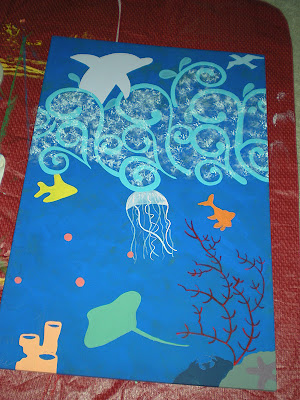
Then, because I was painting to fill another big blank wall, I wanted a companion piece. So I thought, "Land and sea; I'll use the same swirly pattern in the waves and fill the scene with brightly colored little sea creatures instead of birds." I never liked it, though. Here's a photo of it in progress--apparently I never photographed it completed. I think the main problem was that the swirls covered only a small portion of the canvas; I was taking the "wave" concept too literally and restricting the waves to the surface.
But not all is lost. Now the canvas is getting another chance to shine--figuratively. (I'm hoping to create something far more subdued this time around.) I'm not sure whether I want to fill the remaining wall space with art, but I'm considering it. I envision a small grouping of varied-sized frames holding art I could change to fit the season or my mood. Tentatively, this is what I've chosen for the near future:
As winter sets in, I'm craving something sweet and simple--a bit springy, but not a parade of pastels. These pieces, from top to bottom, are:
-a reprint of a page from the Gutenberg Bible, whose significance to literary history you can read about here
-a map of Elizabethan London
-the title from the sheet music to an old song called "Tally Ho." (I don't know the song, in case you wonder.)
-a tear-out from Real Simple magazine, declaring, "Be pretty if you can, be witty if you must, but be gracious if it kills you." -attributed to Elsie de Wolfe
-a little mirror
-a photo of the hollyhocks from my mother's garden
So, while I decide whether or not to bedeck my wall, tell me--what kind of home office or study area do you like the best? One personalized to within an inch of its life? One practical and unadorned? Or something in between? (I'm guessing that's where most of us fall.) Mine is definitely a work in progress. I'll keep you posted.


1 comment:
Hm... My office space (also a guest room) is where I let myself go crazy. The rest of my house, I try to keep *fairly* classy and definitely "grown up." So my office/guest room is where I let my teenaged side out, a little bit. So I guess the answer is "personalized." I use bright colors in my decor, have a striped paper lantern that I would have loved when I was 15 (still do now, obviously), frame my nephews' drawings, and have funky office supplies. My theory is that my office is where I come to be inspired, so I like to keep it light and fun in here.
Have fun redoing your office!
Post a Comment