When I first decided to stick to just four colors in my living room--just four!--I thought I'd lean more toward the cool side of the blue, green, orange, and yellow palette. Instead I find myself wildly attracted to the warm side, beaming with happiness as more citrusy brights enter my space. Compelled by my newfound love of juicy color, I decided to rehabilitate some neutral frames I had lying about.

After a few thin coats--Sherry of Young House Love recommends shooting for coats the thickness of a piece of paper, a visual I find helpful--here's what we had:


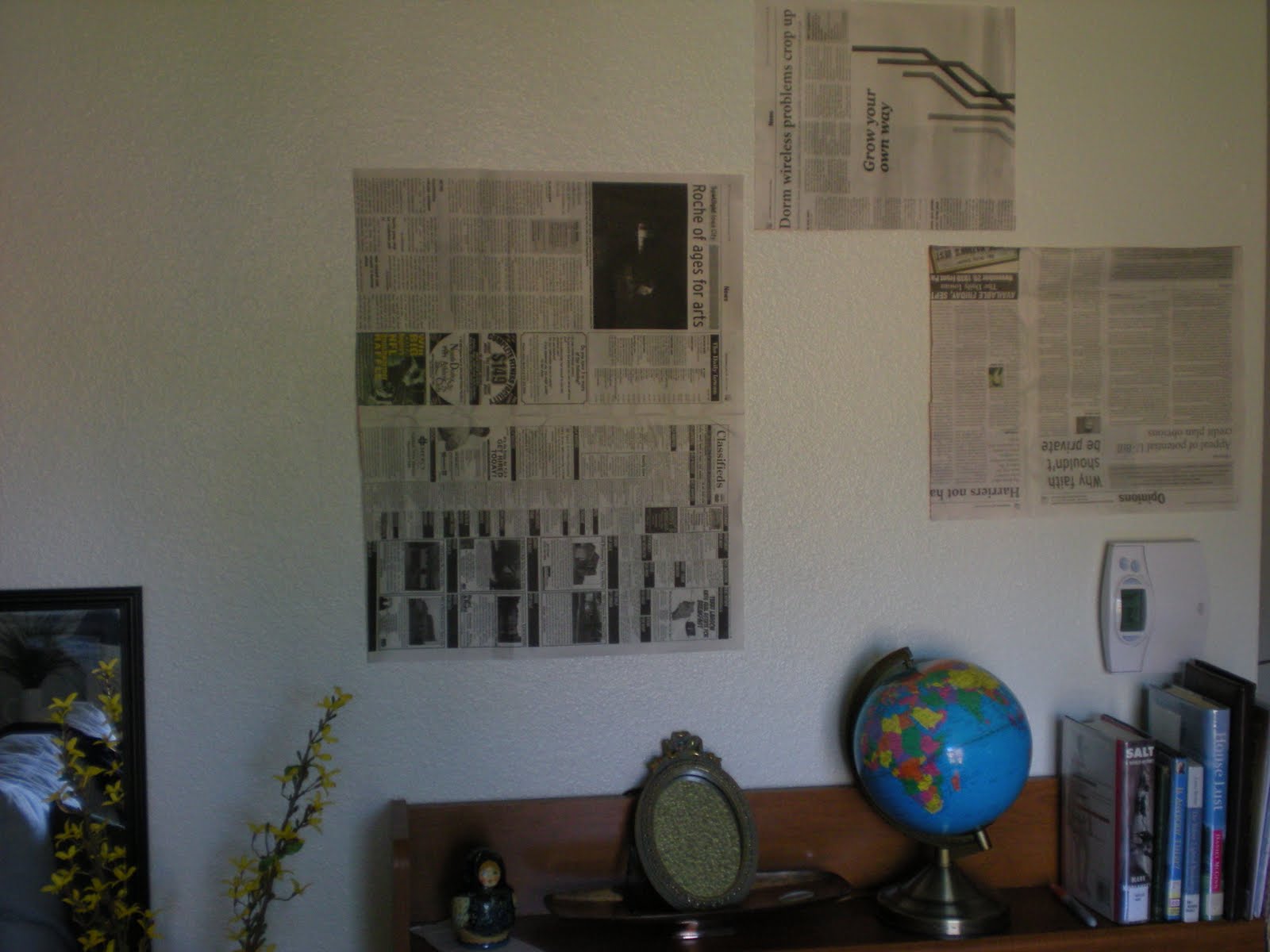

When I finally quit staring, I measured the frames to find out how far from their edges the hanging nails would need to go. After some thinking, pacing, and considering from various angles, I decided on a configuration and pulled out a hammer. I drove a nail for each frame, positioned on the newspaper template in accordance with my earlier measurements.


Thankfully it was nothing Mr. Clean couldn't handle. He flexed a muscle and that pencil mark ran screaming. Whew. Disaster averted. With my wall spic and span, my nails tidily placed, and my spiffy frames begging for a place to shine, I was almost finished.

And I've got to be honest: I'm still only almost finished. I'm not postmodern enough to want empty frames on my wall. I hunted for a beautiful nature photo my hubby took a while back, but in the post-move mess I couldn't figure out where that photo went. Other possible frame-fillers include: ink sketches on parcel paper, small photos centered on green or blue scrapbook paper, or a textile of some sort. (I've found a whimsical embroidered-bird fabric I'd love to bring home, but at $22 a yard that's going on a back burner for a bit. Then again, if they'll sell me a really small piece it wouldn't be bad at all. I wonder...) I think for a while I'll just stare at my wall of potential. Maybe inspiration will strike.
1 comment:
I love the color you painted those frames! I keep seeing the empty frame fad everywhere, but I'm like you and just can't quite get into it. It looks neat, but I have too many pictures I'd like to display to be hanging empty frames. :)
Post a Comment